Checklist
Describe the feature you want
Long press on each tab icon or scrolling down from title bar (in case of single tab enabled) should directly enter full screen and show related content on the right (landscape) or bottom (portrait). Player tabs on full screen should be swipable just like how they are on main player. So, seek position gesture should not work here. Video tabs' buttons and close button (floating on bottom right corner) should appearonly while scrolling content up. No need to show those buttons all the time.
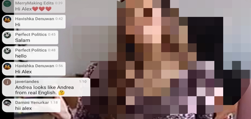
Full screen tabs should be presented as following screenshot no matter which theme is selected. Each comment, segment and part of description should be presented in such curved parts. Applying dark theme on these parts will turn things weird. Unlike the screenshot, the contents should be placed on the right and each part should be curved on all four sides.
One more thing, these tabs should be hidden while showing the video interface.
Transcript tab: On the top of this tab, there should be two drop-down menus.
- Captions
- Audio tracks
Just like chapters, 'Transcript' should let us enter a certain timestamp. Unlike captions, it should only include the starting point of each segment. No need to show every single thing.
Is your feature request related to a problem? Please describe it
Additional context
How will you/everyone benefit from this feature?
.
Checklist
Describe the feature you want
Long press on each tab icon or scrolling down from title bar (in case of single tab enabled) should directly enter full screen and show related content on the right (landscape) or bottom (portrait). Player tabs on full screen should be swipable just like how they are on main player. So, seek position gesture should not work here. Video tabs' buttons and close button (floating on bottom right corner) should appearonly while scrolling content up. No need to show those buttons all the time.
Full screen tabs should be presented as following screenshot no matter which theme is selected. Each comment, segment and part of description should be presented in such curved parts. Applying dark theme on these parts will turn things weird. Unlike the screenshot, the contents should be placed on the right and each part should be curved on all four sides.

One more thing, these tabs should be hidden while showing the video interface.
Transcript tab: On the top of this tab, there should be two drop-down menus.
Just like chapters, 'Transcript' should let us enter a certain timestamp. Unlike captions, it should only include the starting point of each segment. No need to show every single thing.
Is your feature request related to a problem? Please describe it
Additional context
How will you/everyone benefit from this feature?
.